

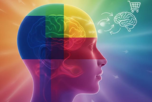
Understanding the Power of Colour Insights
Colour insights reveal how deeply colours influence human emotions and decisions, often without conscious awareness. From the moment someone lands on a website to the instant they choose a product off a shelf, colour plays a decisive role in shaping perception and behavior. Research consistently shows that people form emotional judgments within seconds, and colour is one of the strongest contributing factors.
- Understanding the Power of Colour Insights
- What Are Colour Insights?
- The Psychology Behind Colours and Emotional Responses
- How Colours Influence Emotions
- Colour Insights and Decision-Making Behavior
- The Role of Colour Insights in Branding and Marketing
- Cultural Influences on Colour Interpretation
- Colour Insights in Web Design and User Experience
- How Colours Affect Mood in Physical Spaces
- Everyday Applications of Colour Insights
- Common Misconceptions About Colour Psychology
- Conclusion: Why Colour Insights Are Essential in Modern Communication
In marketing, branding, psychology, and design, colour insights are no longer optional knowledge. Studies indicate that up to 90 percent of first impressions about products are influenced by colour alone. This article explores how colours affect emotions, guide decision-making, and shape consumer behavior, while providing practical, research-backed insights that can be applied in real-world scenarios.
What Are Colour Insights?
Colour insights refer to the psychological, emotional, and behavioral understanding of how different colours affect human perception. This field combines principles from psychology, neuroscience, branding, and cultural studies to explain why certain colours evoke specific emotional responses.
At a fundamental level, colour insights help explain why blue is associated with trust, red with urgency, and green with balance. These associations are formed through a combination of biological responses and learned cultural meanings. When used strategically, colour insights can improve communication, increase engagement, and influence decisions across industries.
The Psychology Behind Colours and Emotional Responses
The psychological impact of colour begins in the brain. When light enters the eye, it is processed by the retina and transmitted to the hypothalamus, which regulates hormones and emotional responses. This process explains why colours can affect heart rate, stress levels, appetite, and focus.
Warm colours such as red, orange, and yellow tend to stimulate energy and excitement, while cool colours like blue and green promote calmness and relaxation. Neutral tones such as black, white, and gray often communicate sophistication, clarity, or neutrality depending on the context.
Scientific studies in colour psychology confirm that these emotional reactions are not random. They are deeply connected to both evolutionary survival mechanisms and long-standing social conditioning.
How Colours Influence Emotions
Each colour carries emotional weight that can alter how people feel in a given moment. Red is commonly linked to passion, urgency, and intensity, which is why it is often used in sales promotions and food branding. Blue conveys trust, stability, and calm, making it a popular choice for financial institutions and technology companies.
Yellow is associated with optimism and happiness, though excessive use can create anxiety. Green symbolizes balance, health, and growth, frequently appearing in wellness and environmental branding. Purple suggests creativity and luxury, while black communicates power, elegance, and authority. White often represents simplicity, cleanliness, and clarity.
Understanding these emotional associations is essential for applying colour insights effectively, especially in environments where emotional responses directly impact decisions.
Colour Insights and Decision-Making Behavior
Colour insights demonstrate that emotions strongly influence decisions, particularly purchasing behavior. Consumers rarely make decisions based solely on logic. Instead, emotions triggered by visual cues, especially colour, guide choices.
In retail and digital marketing, red is often used to create urgency and encourage immediate action. Blue builds trust and confidence, increasing the likelihood of long-term engagement. Green reassures buyers who prioritize health, sustainability, or ethical values.
A well-documented example is the use of call-to-action buttons in web design. Studies show that changing a button’s colour can significantly improve conversion rates, even when the text remains unchanged. This highlights how colour insights directly affect behavior without altering content.
The Role of Colour Insights in Branding and Marketing
Brand identity relies heavily on colour consistency. Research from the University of Loyola, Maryland found that consistent colour usage can increase brand recognition by up to 80 percent. This makes colour insights a critical component of long-term brand strategy.
Successful brands choose colours that align with their personality and audience expectations. Technology brands often rely on blue to convey reliability and intelligence, while luxury brands favor black or deep purple to signal exclusivity. Food brands commonly use red and yellow to stimulate appetite and grab attention.
When colours align with brand values, customers form emotional connections that go beyond product features or pricing.
Cultural Influences on Colour Interpretation
Colour insights must always be viewed through a cultural lens. While some colour associations are biologically rooted, many are shaped by tradition, religion, and social norms. A colour that conveys positivity in one culture may carry negative meaning in another.
For example, white symbolizes purity and simplicity in many Western cultures, yet it represents mourning in parts of Asia. Red is associated with danger or urgency in Western countries but symbolizes luck and prosperity in China. Purple, often linked to royalty in Europe, can represent mourning in certain regions of South America.
Brands operating internationally must research cultural colour meanings carefully to avoid misinterpretation and reputational risk.
Colour Insights in Web Design and User Experience
In digital environments, colour insights directly influence usability and engagement. Colour affects how users navigate a website, where they focus their attention, and whether they take action.
High-contrast colour combinations improve readability and accessibility, particularly for users with visual impairments. Calm colour palettes increase session duration, while strategically placed accent colours guide users toward important elements such as buttons or forms.
According to accessibility research, more than 300 million people worldwide experience some form of colour vision deficiency. This makes thoughtful colour contrast and clarity essential for inclusive design.
How Colours Affect Mood in Physical Spaces
Colour insights extend beyond screens into physical environments such as offices, schools, and homes. Environmental psychology shows that colour can significantly affect mood, productivity, and well-being.
Blue tones are often used in offices to reduce stress and improve focus. Green is linked to balance and restoration, making it effective in classrooms and healthcare settings. Yellow can enhance creativity in small doses but may cause agitation if overused.
A study conducted by the University of Texas found that employees working in gray or beige offices reported higher levels of sadness and fatigue, demonstrating how colour directly influences emotional states.
Everyday Applications of Colour Insights
Colour insights can also be applied to everyday choices, including clothing, presentations, and personal spaces. Wearing darker colours such as black or navy can project authority and confidence, while lighter colours communicate openness and approachability.
In presentations, blue backgrounds are shown to improve comprehension and trust, while excessive red text can cause eye strain. Green is often preferred for data visualization due to its visual comfort and clarity.
These small adjustments, guided by colour insights, can create meaningful improvements in communication and perception.
Common Misconceptions About Colour Psychology
One common myth is that colour meanings are universal. In reality, context and culture heavily influence interpretation. Another misconception is that brighter colours always perform better, when in fact muted or minimalist palettes often outperform bold colours in luxury and professional markets.
There is also a belief that one colour choice fits all brands. Effective use of colour insights requires alignment with brand identity, audience expectations, and emotional goals.
Conclusion: Why Colour Insights Are Essential in Modern Communication
Colour insights provide a powerful framework for understanding how emotions and decisions are shaped through visual perception. Whether applied to branding, marketing, design, or everyday interactions, colour has the ability to influence behavior without words.
By using colour strategically and thoughtfully, individuals and businesses can build trust, improve engagement, and guide decision-making more effectively. In a visually driven world, mastering colour insights is not just an advantage — it is a necessity.